Impactful Design
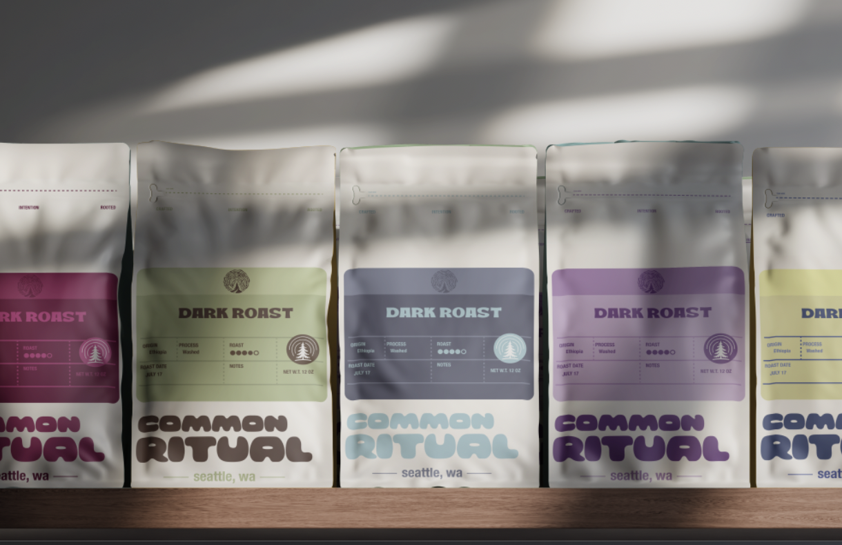
I made these assets and this branding based off of a coffee roaster I used to work with. The original name of the company is This Coffee Life. I have always really enjoyed the coffee from this roaster but hated the organization, coloring, name, and even the packaging. They originally were named passerine, they were a little more visually appealing, but still just random birds on the packaging.
With this project, I created clearer branding, clear coloring, and a consistency that this company has lacked for many years. The packaging would be used based off of the region the coffee is coming from. This means you could be specific with the main colors for the countries and then down to the shades for different regions. That is why I have a lighter shade above the main block of information, this way it displays the region as well.
I also chose to change the name from This Coffee Life, to Common Ritual. The original name is alluding to coffee is life, that coffee is everything. While the name gets the point across I think that it is poorly representative of the entire company. I chose Common Ritual because it is like the habit of the consumer to come and drink coffee, it is their routine, their ritual. While the roaster also has his routine, habit, and ritual for roasting. This encompasses the coffee is life a little more whole heartedly and includes, the roaster, barista, and the customer.
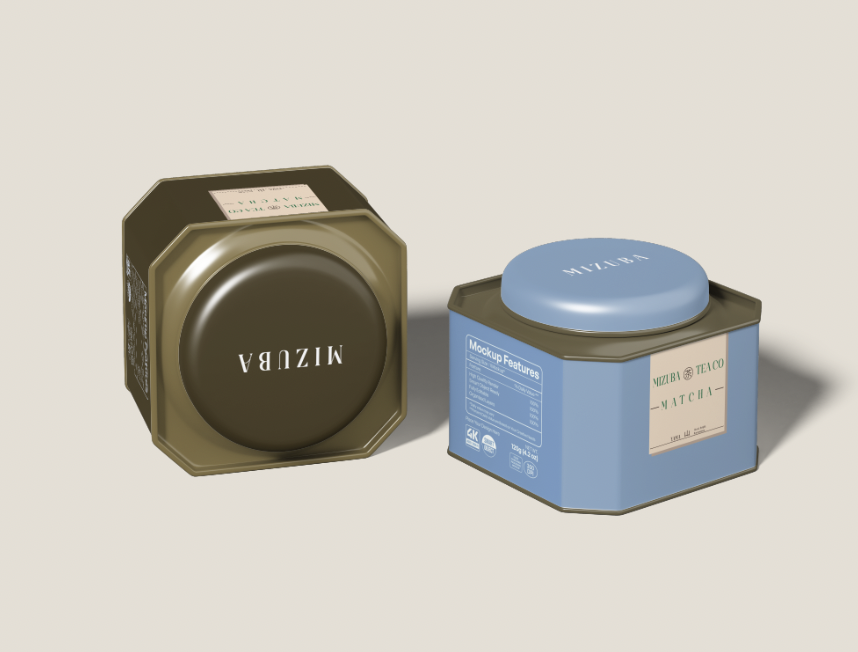
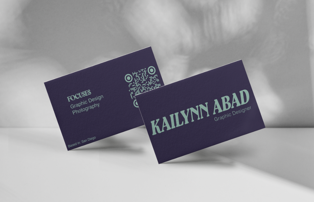

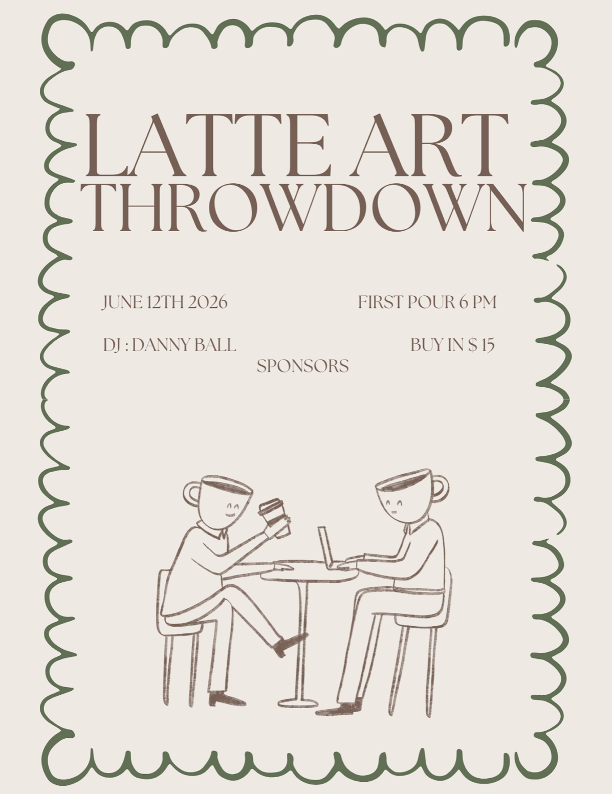
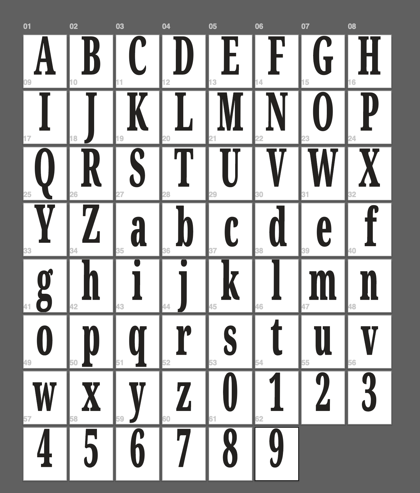
I have hand created multiple, usable fonts. I made these back in 2022, and do not have any of my original sketches. One of them is a pretty basic, bold serif typeface. It did well in the class, and I think it works well for titles or covers of things with the way it is naturally bold, while not being too chunky.
While the second is based off of a type of handwriting I used to do for fun, putting it on cards and different gifts. I thought it would be cool to have something similar digitally. I do think that I run into some consistency issues based on the shaping of each of the lowercase letters, making the words look a little lopsided.

I completed this illustration for a class in 2024. I am proud of this project because I have always admired nurses, and the selfless contribution they give to society. Nurses have such a thankless job, I thought it would be nice to highlight them. I illustrated an anatomically correct heart, not only for the medical field. But, for the heart and love that nurses have, and give to their patients on a daily basis.
Endorsements of Proven Performance

“Clear communication, detailed work, and friendly advice.”
Abigail Trunky

“Received illustrations in a timely manner, she went the extra mile and did some last minute changes.”
Ben

“Worked with me to figure out exactly what I was looking for without me even fully knowing.”
Emily Chang