 Image 1 of 4
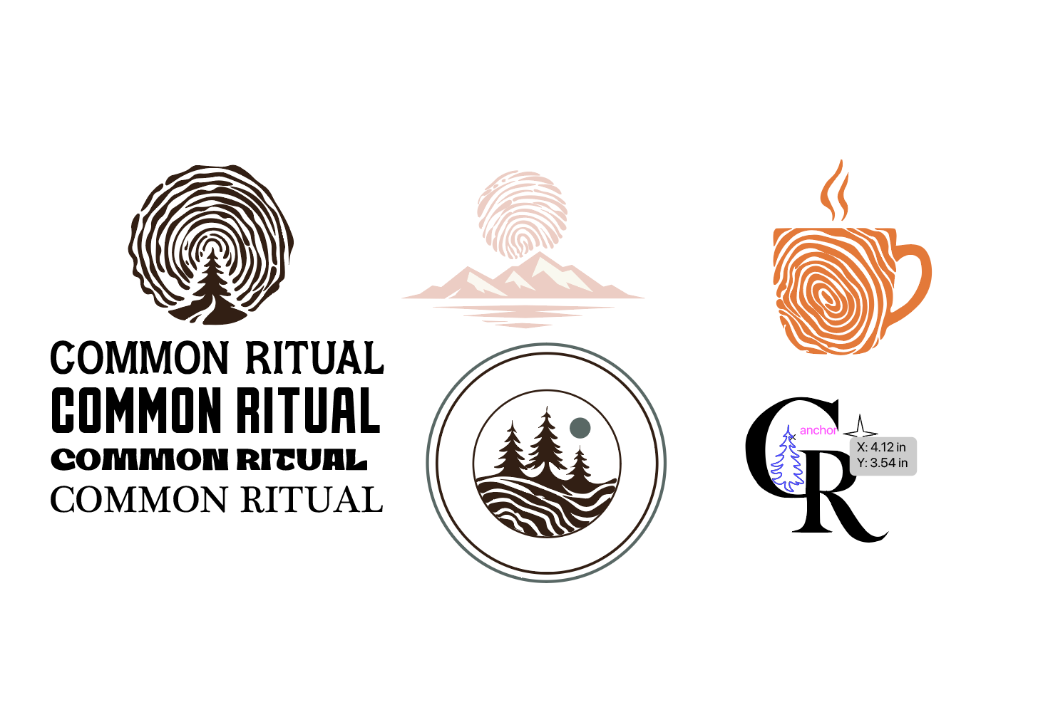 Image 2 of 4
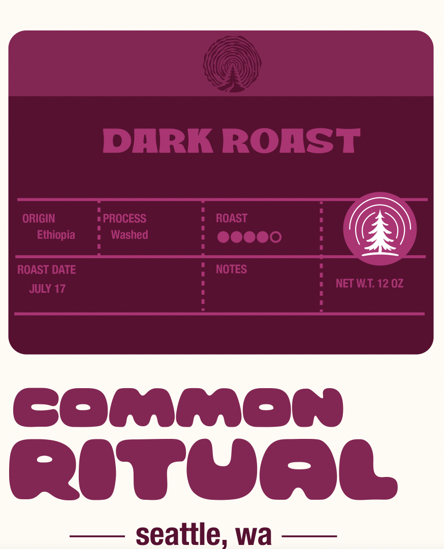 Image 3 of 4
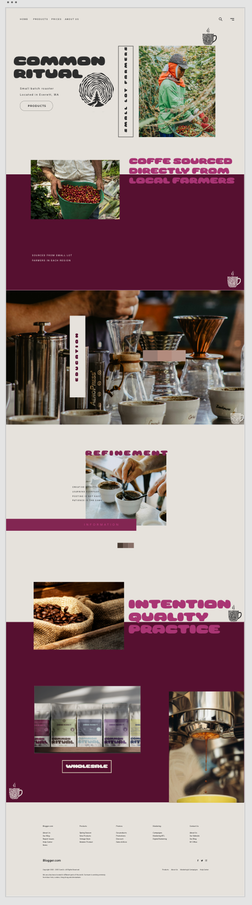 Image 4 of 4
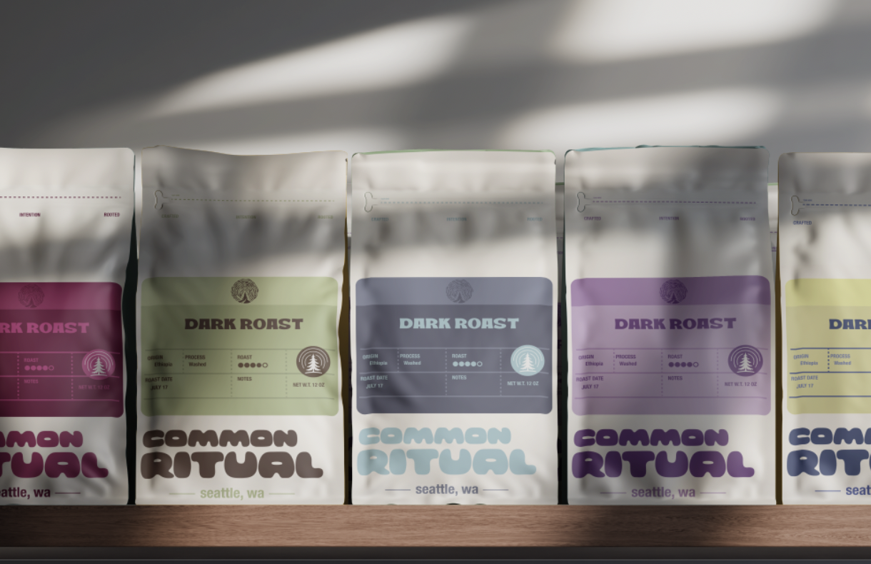
I made these assets and this branding based off of a coffee roaster I used to work with. The original name of the company is This Coffee Life. I have always really enjoyed the coffee from this roaster but hated the organization, coloring, name, and even the packaging. They originally were named passerine, they were a little more visually appealing, but still just random birds on the packaging.
With this project, I created clearer branding, clear coloring, and a consistency that this company has lacked for many years. The packaging would be used based off of the region the coffee is coming from. This means you could be specific with the main colors for the countries and then down to the shades for different regions. That is why I have a lighter shade above the main block of information, this way it displays the region as well.
I also chose to change the name from This Coffee Life, to Common Ritual. The original name is alluding to coffee is life, that coffee is everything. While the name gets the point across I think that it is poorly representative of the entire company. I chose Common Ritual because it is like the habit of the consumer to come and drink coffee, it is their routine, their ritual. While the roaster also has his routine, habit, and ritual for roasting. This encompasses the coffee is life a little more whole heartedly and includes, the roaster, barista, and the customer.